 Younho9 Notes
CSS 속성 11. float position
CSS 속성 11. float position❗️ 해당 글은 패스트캠퍼스 - 프론트엔드 개발 강의에서 HTML & CSS, SASS(SCSS) Part의 박영웅 강사님의 강의자료를 정리한 것입니다.
float
요소를 좌우 방향으로 띄움(수평 정렬)
☝️ CSS3에서 Flexible box 라는 개념이 등장하면서 최근에는 float 보다 Flexible box 를 이용한 수평 정렬을 하는 편이다.
속성 값
| 값 | 의미 | 기본값 |
|---|---|---|
| none | 요소 띄움 없음 | none |
| left | 왼쪽으로 띄움 | |
| right | 오른쪽으로 띄움 |
단순 띄움 사용법
<article><div class="picture"></div>Lorem ipsum...dolore voluptatum!</article>
<article><div class="picture"></div>Lorem ipsum...dolore voluptatum!</article>
article .picture {width: 200px;height: 150px;background: tomato;float: left;margin-right: 20px;margin-bottom: 10px;}
article .picture {width: 200px;height: 150px;background: tomato;float: left;margin-right: 20px;margin-bottom: 10px;}
float-left
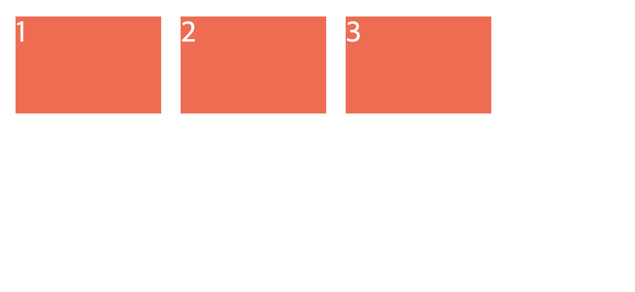
수평 정렬 사용법
float 을 이용하면 block 요소를 수평으로 정렬하는 것이 가능하다.
<div class="box">1</div><div class="box">2</div><div class="box">3</div>
<div class="box">1</div><div class="box">2</div><div class="box">3</div>
.box {width: 150px;height: 100px;background: tomato;color: white;font-size: 30px;margin: 10px;float: left;}
.box {width: 150px;height: 100px;background: tomato;color: white;font-size: 30px;margin: 10px;float: left;}
float-horizon
float: right; 로 변경 시 쌓이는 순서 또한 변경된다.
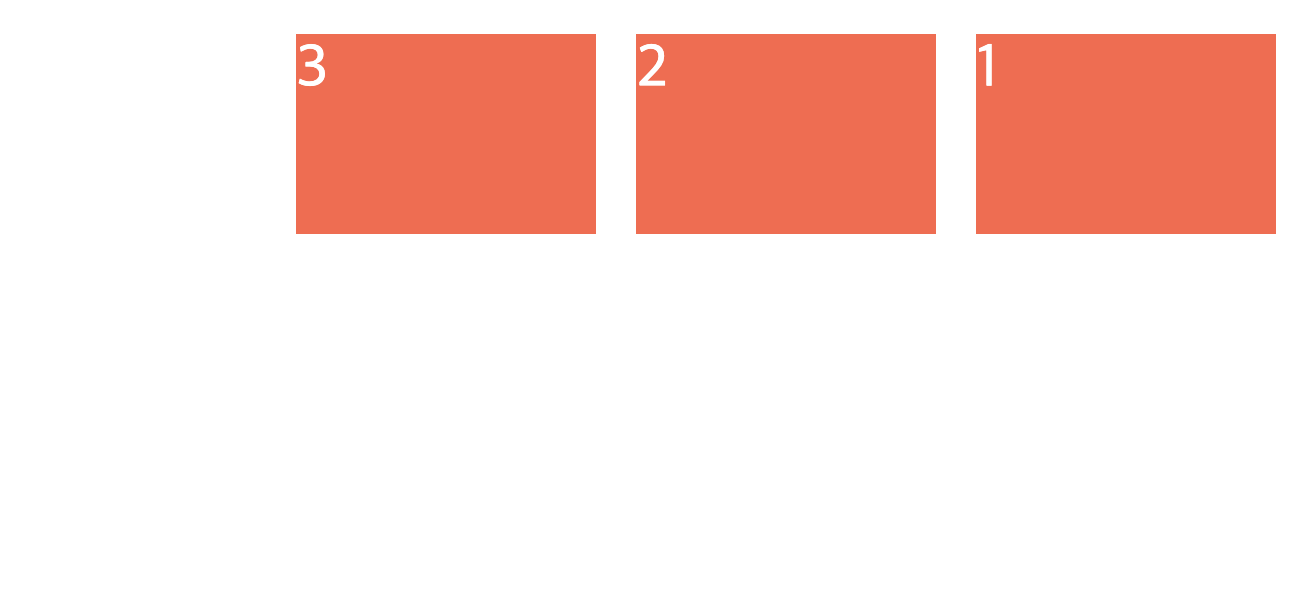
float-horizon-right
float 해제
float 속성이 적용된 요소의 주위로 다른 요소들이 흐르게 되는데 이를 방지하기 위해 속성을 해제해야 한다.
형제 요소에
clear: (left, right, both)추가하여 해제부모 요소에
overflow: (hidden, auto)추가하여 해제부모 요소에
clearfix클래스 추가하여 해제 (추천!)
형제 요소에서 해제
float 속성이 추가된 요소의 다음 형제 요소에 clear 속성 추가
<div class="float-left"></div><div class="float-left"></div><div class="next"></div>
<div class="float-left"></div><div class="float-left"></div><div class="next"></div>
.float-left {width: 100px;height: 100px;background: tomato;float: left;}.next {clear: both;}
.float-left {width: 100px;height: 100px;background: tomato;float: left;}.next {clear: both;}
☝️ 항상 다음 요소를 만들어주어야 한다는 문제점
부모 요소에서 해제 - overflow
float 속성이 추가된 요소의 부모 요소에 overflow 속성을 추가해 보이지 않게 하는 방법.
<div class="parent"><div class="child"></div><div class="child"></div></div>
<div class="parent"><div class="child"></div><div class="child"></div></div>
.parent {overflow: hidden; /* or auto */}.child {float: left;}
.parent {overflow: hidden; /* or auto */}.child {float: left;}
☝️ 다음 요소를 만들지 않아도 되는 장점이 있지만 관련 없는 속성으로 해결하는 일종의 ’편법’으로 사용을 권장하지 않음
부모 요소에서 해제2 (추천!)
float 속성이 추가된 요소의 부모 요소에 미리 지정된 clearfix 클래스 추가
<div class="parent clearfix"><div class="child"></div><div class="child"></div></div>
<div class="parent clearfix"><div class="child"></div><div class="child"></div></div>
💡 참고 : 가상 요소 선택자
.clearfix::after {content: "";clear: both;display: block; /* or table */}.child {float: left;}
.clearfix::after {content: "";clear: both;display: block; /* or table */}.child {float: left;}
display 수정
inline 요소의 경우 float 속성이 부여되었을 때 자동적으로 block 요소의 특성을 갖게 된다. 따라서 float 속성을 사용할 때 display: block; 을 따로 지정할필요가 없다.
| 지정값 | 변화값 |
|---|---|
| inline | block |
| inline-block | block |
| inline-table | block |
| table-row | block |
| table-row-group | block |
| table-column | block |
| table-column-group | block |
| table-cell | block |
| table-caption | block |
| table-header-group | block |
| table-footer-group | block |
| flex | flex / float 속성 효과없음 |
| inline-flex | inline-flex / float 속성 효과없음 |
| 그 외 | 변화없음 |
☝️ 대부분의 값이 block 으로 변경되는데 flex , inline-flex 의 경우 변경되지 않는다.
clear
float 속성이 적용되지 않도록 지정(해제)
속성 값
| 값 | 의미 | 기본값 |
|---|---|---|
| none | 요소 띄움 허용 | none |
| left | 왼쪽 띄움 해제 | |
| right | 오른쪽 띄움 해제 | |
| both | 양쪽(왼쪽, 오른쪽) 모두 띄움 해제 |
position
요소의 위치 지정 방법의 유형(기준)을 설정
속성 값
| 값 | 의미 | 기본값 |
|---|---|---|
| static | 유형(기준) 없음 / 배치 불가능 | static |
| relative | 요소 자신을 기준으로 배치 | |
| absolute | 위치 상 부모 요소를 기준으로 배치 | |
| fixed | 브라우저(뷰포트)를 기준으로 배치 | |
| sticky | 스크롤 영역 기준으로 배치 |
relative
원래 위치해야 할 위치에 대한 상대적인 위치
<div class="box">1</div><div class="box relative">2</div><div class="box">3</div>
<div class="box">1</div><div class="box relative">2</div><div class="box">3</div>
.box {width: 100px;height: 100px;background: tomato;border: 4px dashed red;border-radius: 20px;display: flex;justify-content: center;align-items: center;font-size: 30px;}.relative {position: relative;top: 100px;left: 30px;}
.box {width: 100px;height: 100px;background: tomato;border: 4px dashed red;border-radius: 20px;display: flex;justify-content: center;align-items: center;font-size: 30px;}.relative {position: relative;top: 100px;left: 30px;}
☝️ relative 속성값을 가진 요소는 자기 자신이 원래 있었던 위치에서 주변 요소에영향을 준다.
absolute
<div class="grand-parent"><div class="parent"><div class="child">1</div><div class="child absolute">2</div><div class="child">3</div></div></div>
<div class="grand-parent"><div class="parent"><div class="child">1</div><div class="child absolute">2</div><div class="child">3</div></div></div>
.grand-parent {width: 400px;height: 300px;padding: 30px 100px 100px 30px;border: 4px dashed lightgray;}.parent {width: 400px;height: 300px;border: 4px dashed gray;position: relative;}.child {width: 120px;height: 80px;background: tomato;border: 4px dashed red;border-radius: 10px;font-size: 30px;display: flex;justify-content: center;align-items: center;}.absolute {position: absolute;bottom: 50px;right: 50px;}
.grand-parent {width: 400px;height: 300px;padding: 30px 100px 100px 30px;border: 4px dashed lightgray;}.parent {width: 400px;height: 300px;border: 4px dashed gray;position: relative;}.child {width: 120px;height: 80px;background: tomato;border: 4px dashed red;border-radius: 10px;font-size: 30px;display: flex;justify-content: center;align-items: center;}.absolute {position: absolute;bottom: 50px;right: 50px;}
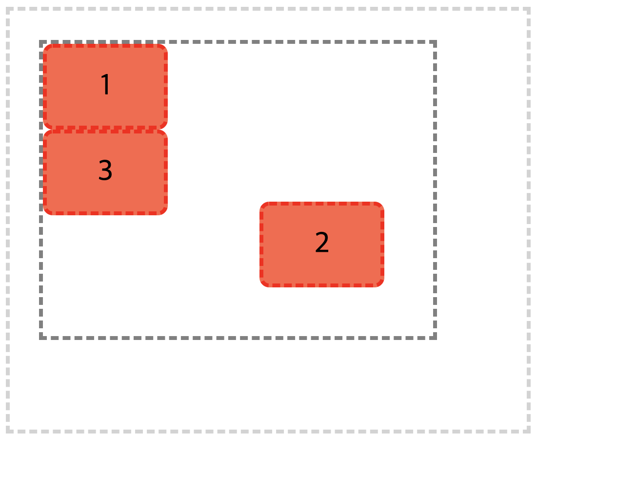
position-absolute
💡 위치상 부모 요소 - 조상 요소 중 position 속성이 부여되어 있는 요소 ( static 제외 )조상 요소에 없다면 -> body (일반적으로 없음) -> html (일반적으로 없음) -> window 객체 (뷰포트)
fixed
브라우저(뷰포트)를 기준으로 함 - 스크롤을 내려도 해당 위치에 고정됨.
sticky
스크롤 영역 기준으로 배치
.box {position: sticky;top: 0;}
.box {position: sticky;top: 0;}
☝️ top , bottom , left , right 중 하나 이상의 요소 사용.IE 지원 불가.
요소 쌓임 순서(Stack order)
요소가 쌓여 있는 순서를 통해
어떤 요소가 사용자와 가깝게 있는지(더 위에 쌓이는지)를 결정 (Z축)
static을 제외한position속성의 값이 있을 경우 가장 위에 쌓임(값은 무관)position이 모두 존재한다면z-index속성의 숫자 값이 높을 수록 위에 쌓임position속성의 값이 있고,z-index속성의 숫자 값이 같다면, ‘HTML’ 의 마지막 코드일수록 위에 쌓임(나중에 작성한 코드(요소))
position > z-index > HTML 마지막 코드
position > z-index > HTML 마지막 코드
☝️ z-index 는 position 속성이 설정된 요소에 대해서만 의미를 갖는다.
display 수정
float 속성과 비슷하게 absolute , fixed 속성 값이 적용된 요소는 display 속성의 값이 대부분 block 으로 수정된다.
| 지정값 | 변화값 |
|---|---|
| inline | block |
| inline-block | block |
| inline-table | block |
| table-row | block |
| table-row-group | block |
| table-column | block |
| table-column-group | block |
| table-cell | block |
| table-caption | block |
| table-header-group | block |
| table-footer-group | block |
| flex | flex / float 속성 효과없음 |
| inline-flex | inline-flex / float 속성 효과없음 |
| 그 외 | 변화없음 |
top , bottom , left , right
요소의 position 기준에 맞는 ‘위쪽’, ‘아래쪽’, ‘왼쪽’, ’오른쪽’에서의 거리(위치 )를 설정
| 값 | 의미 | 기본값 |
|---|---|---|
| auto | 브라우저가 계산 | |
| 단위 | px , em , cm 등 단위로 지정 | 2020-02-03 00:00:00 |
| % | 부모(위치 상의 부모(조상)) 요소의 가로 또는 세로 너비의 비율로 지정, 음수 값 허용 |
☝️ 위의 네 요소는 position 속성이 지정되어 있을 때만 사용할 수 있다.
Reference
패스트캠퍼스 - 프론트엔드 개발 강의 - HTML & CSS, SASS(SCSS) Part by ParkYoungWoong